Background
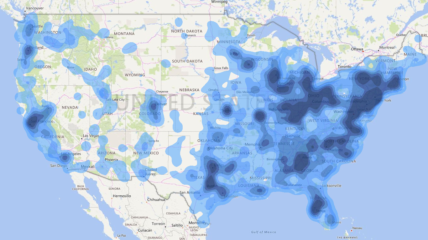
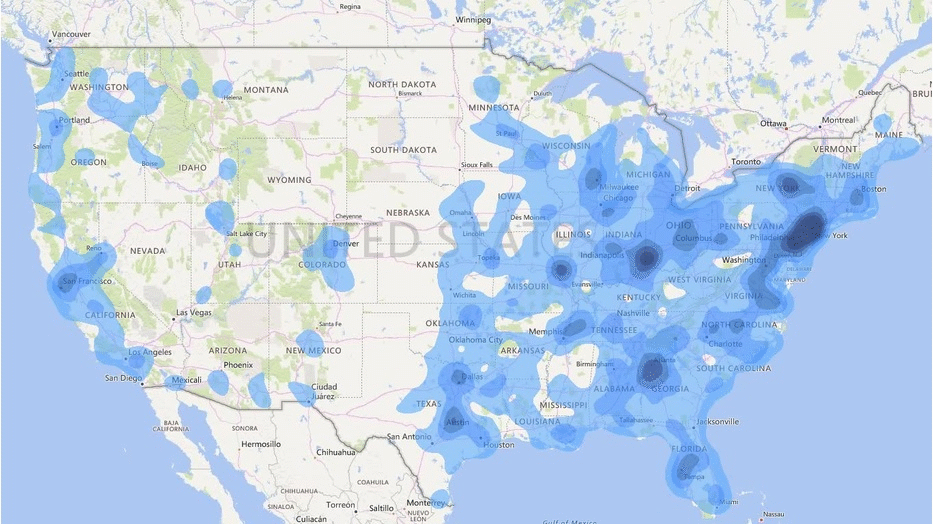
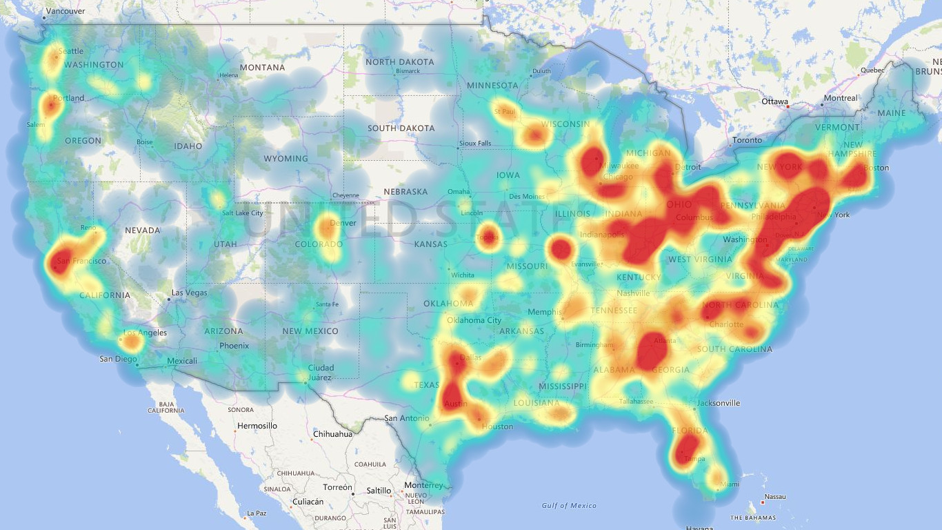
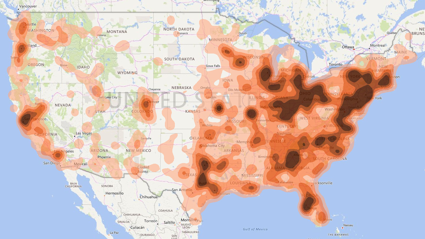
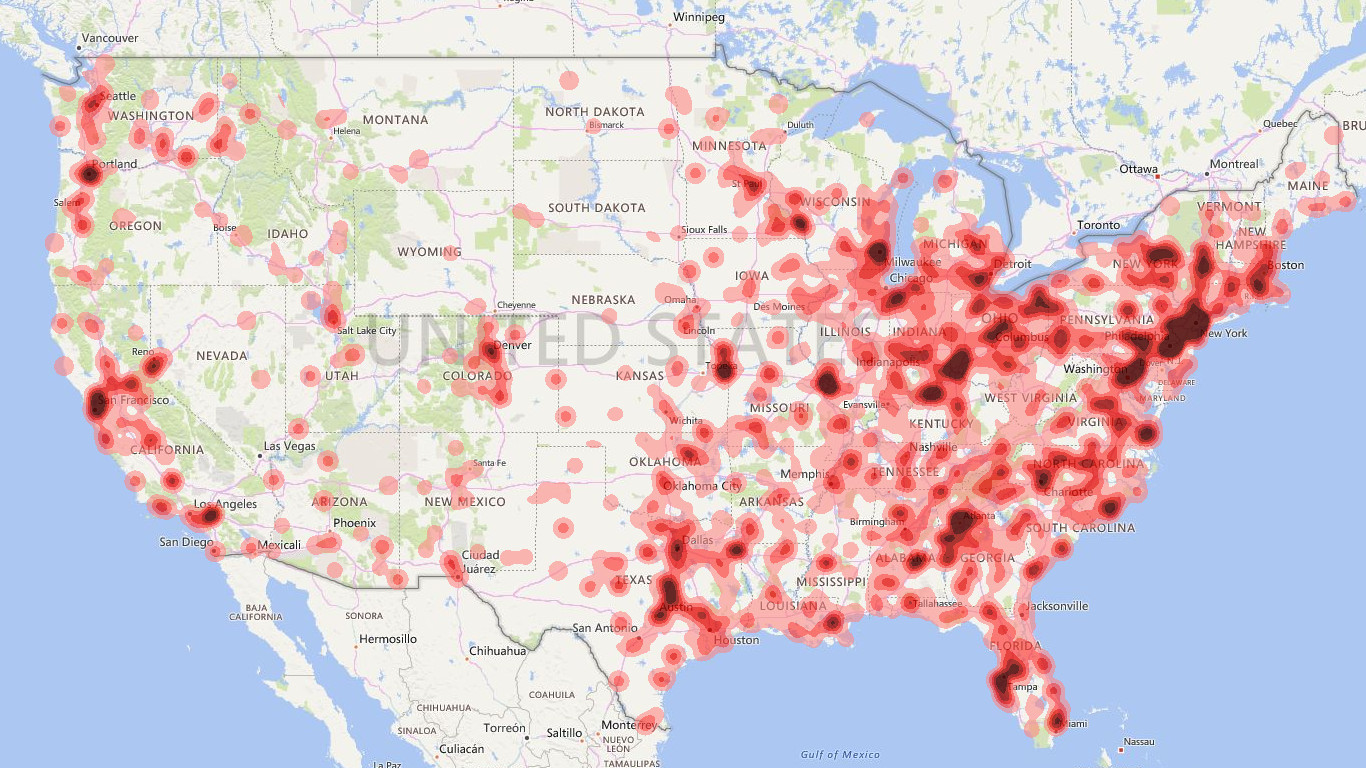
Heat maps are a type of visualization to show data density on a map. They are particularly helpful when you have a lot of (e.g., tens of thousands of) data points on the map and are mainly interested in their overall distribution. Technically, in a heatmap, data points are aggregated locally and mapped to colors (either gradient or quantile), so that we can make better sense of the density of the data from the colors while still being able to see and use the map.
Where to Get It
This visual can be downloaded from Office Store or the dist folder of this repo.
- Update 1.0.X:
- Location (ID) is required in this version to identify different geo-coordinates.
- Update 1.1.3:
- Location (ID) is no longer a must. You can direcly use geo-coordinates to place data.
- Add Map control format: Map-related controls are moved here (from Advance). Some more controls are added, such as map type.
- Add Map element format: If you find some map element distracting, you can turn them off here to give you a clearer background.
- Update 1.1.4:
- Fix (likely) the issue of “cannot directly drag-and-drop geo-coordinates”.
- Update 1.1.5:
- Refine Map control - Type: Add several built-in styles.
- Add Map control - Auto fit. Now the visual can automatically fit every point in the view when the input data is changed.
- Fix some bugs.
- Update 1.1.6:
- Handle the extreme case when no valid locations available.
- Update 1.1.7:
- Fix the bug that cannot cancel geocoding.
- Update 1.1.8:
- Fix the bug that misplaces the color legend.
- Update 1.1.9 (store version):
- Show an error message when WebGL is not supported (instead of showing nothing).
How to Use (For the latest version)
This visual requires WebGL, which however may not be supported by every device. In case of seeing the “not-supported error”, you may need to try a different machine. Sorry about the limitation.
- Required fields (You only need one of these two fields):
- Location (ID): Values in this field are used to identify different geo-coordinates. They may be treated as addresses (or zip codes) and used to query geo-locations (through Bing Maps REST Services) if latitude/longitude are not specified. Please note that integer values in this field are directly treated as zip codes when geocoding.
- Latitude/Longitude: These fields specify the geo-locations of data points. If both are specified, the geocoding will not happen.
- Optional fields:
- Value: This field specifies the exact values associated to the addresses. They have to be numerical. The default value is 1.
- Group: Data points will be split into multiple groups based on this field. Once this field is specified, Group and Animation features will be enabled in the format panel. For example, if your data points have timestamps, you can group them based on the timestamps, then either 1) selectively show the heatmap for some specific timestamps or 2) run an animation to see the heatmap changing over time.
- Special settings:
- Renderer - Type: You can choose between
HeatandContour. - Renderer - Radius: It defines how close two data points can be aggregated together. If you like to see more details, you may reduce the value.
- Renderer - Measure: It defines the strategy to find the largest aggregated value based on data point groups, which will further determine the color mapping scheme. For example (please note that each group can find its max aggregated value independently):
- Average: Choose the average of all max values (each group may have one).
- Highest: Choose the largest of max values.
- Sum: Choose the sum of all the max values. This is the default option.
- First/Last: Sort all groups, then choose the max value of the first/last group.
- Manual: Directly take the user input.
- Contour map: Customize the color mapping scheme for the
Contourtype. Here you can give at-most five thresholds to set different colors. The thresholds can be set- either relative to the max aggregated value that is decided by Renderer - Measure,
- or using absolute values.
- Heat map: Customize the color mapping scheme for the
Heattype. You need to give five values between 0 and 1 (relative to the aforementioned max aggregated value) and five colors. - Animation - Freezing/Morphing: How long (in seconds) the playback will pause for each group or animate from one group to the next one.
- Advance - Cache: Store the geocoding results, so they can be reused when you open the report next time. Otherwise, the geocoding process will be repeated, which is quite slow. But caching many locations also may increase your file size.
- Map control - Language: Choose a specific language for the background map.
- Map control - Type: Choose between road style and aerial style.
- Map element: If you find some map element distracting, you can turn them off here to give you a clearer background.
- Renderer - Type: You can choose between
- Need more help? Please leave a comment below.